Delivered
Adeline Fotografie: from portfolio to findable website
Adeline photographs interiors, holiday homes and business premises in the Veluwe region and beyond. The work was good. The website wasn't. This is how I changed that, from the first line of code to the first assignments via Google.
To be transparent, because it's part of the story: Adeline Fotografie is a trade name of my own company, Future Legacy. Adeline is my wife. That makes this not a client case at arm's length but a project in which I made every decision myself, from the first line of code to the button a visitor clicks to get in touch. I had all the freedom and all the responsibility too. So what's below isn't what an agency promises, but what actually happened when I had to deliver it myself.
The brief
Adeline already had a site. Self-made, simple, mainly a place to show photos. As a digital business card it did its job, but it went no further. No clear structure, visually thin and not built to make anything happen.
We wanted something different. A website that's more than a portfolio. A site that shows her craft, sets out a clear proposition with packages and prices and leads the visitor to one logical next step: getting in touch. In short, from an online photo album to a site that brings in clients.
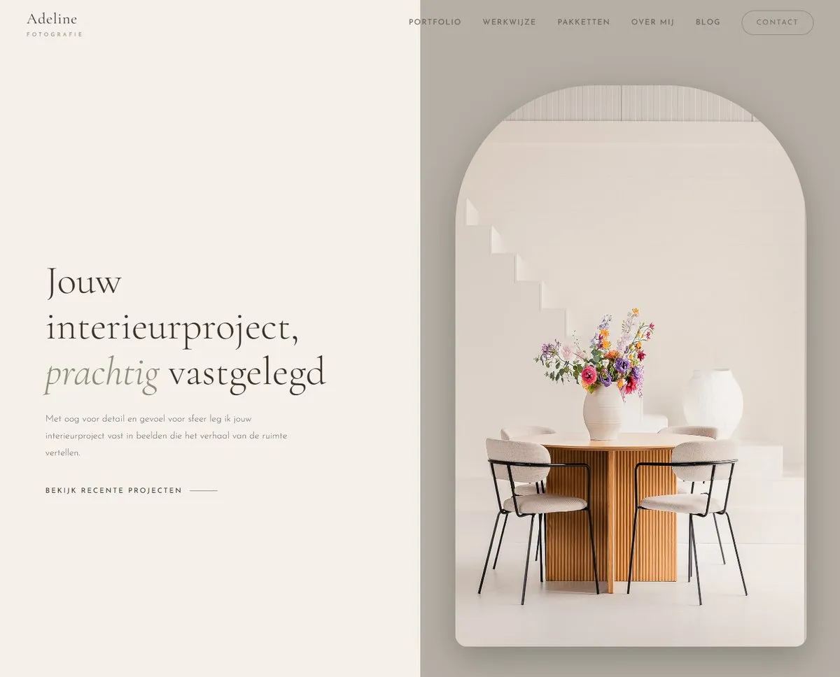
The new homepage. Calm, with the photos in the lead.
The starting point
The old site was a portfolio and not much more. The photos were there, but there was no story behind it and no direction to it. A visitor saw beautiful images and afterwards still didn't know what exactly Adeline offers, what it costs or how to engage her.
On top of that came findability. In Google there was still all sorts of things from the old setup: outdated page links under the search results and a messy picture that no longer matched what the site needed to convey. The basis for good findability simply wasn't there. No clean structure, no technical SEO, nothing to help search engines understand what there was to find here.
What I built and why
I started with the design, not the technology. First I worked out the entire homepage as a static HTML mockup. That way Adeline could see and approve the full design before a single WordPress file was involved. No surprises afterwards, no building and then hoping it lands well. We knew exactly how it would look.
Then I converted that mockup into a fully custom WordPress theme. Deliberately no page builder. A page builder is quicker to set up, but you pay for it in slow load times, messy code and a design that's always just slightly off from what you had in mind. I wanted it the other way around: clean, light code that follows the design exactly and that I fully control. So custom PHP templates for the header, the footer, the homepage, the individual posts and the blog overviews. Nothing superfluous.

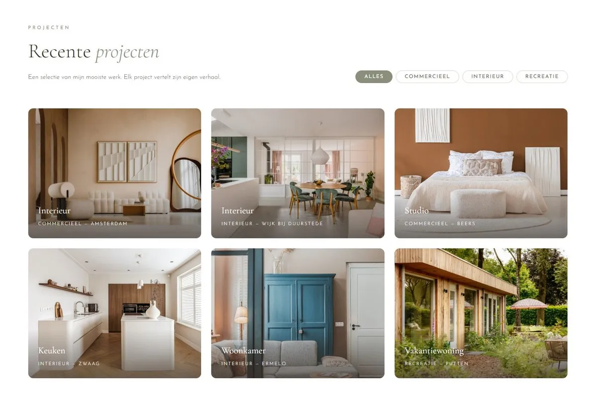
The portfolio with filters per category: commercial, interior, recreation.
A few choices that show the craft:
The portfolio gallery caused problems at first. My own CSS clashed with the way WordPress renders galleries. The temptation then is to layer yet more fixes on top. I did the opposite and removed the conflicting code instead, so WordPress's native gallery blocks could do their work. Less code, better result. That's often a better fix than stacking more on top.
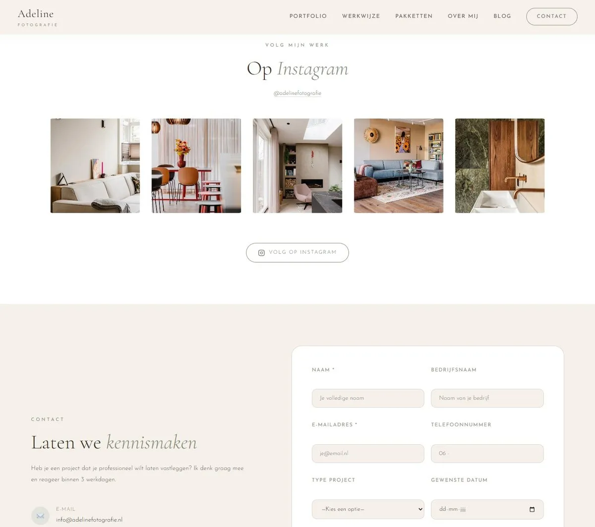
The Instagram feed automatically pulls in Adeline's latest posts. The plugin that handles that forced its own styling that overrode my design. I wrote a piece of JavaScript for that, which brings the grid back neatly in line with the rest of the site.
The Instagram feed, back in line with the design. Below it the contact form everything leads to.
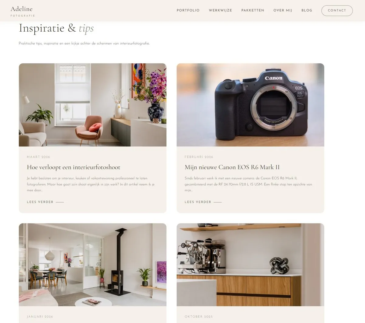
And I set up a blog with four Dutch-language articles. Not to fill up the site, but because good content on the right keywords brings in exactly the traffic you can do something with.
The blog. Content on the right keywords, no filler.
The packages are in a clear section with transparent prices. No hidden costs, no surprises. From every section, the visitor eventually walks to the same point: the contact form.
SEO and indexing
A beautiful site that nobody finds is an expensive hobby. So I tackled findability just as seriously as the design.
The basics first. SEO-friendly URLs, and via Yoast a considered title and description for each page as it appears in Google. Then linked Google Search Console, verified the site and submitted the sitemap, so Google knows all the pages. For the most important pages I manually requested reindexing, so Google reviews them again with priority. I cleaned up the old, outdated links in the search results, so the picture in Google matches the new site again.
On top of that a layer that goes beyond standard. I added structured data per Schema.org: data that tells Google directly that this is a local business, which services it provides and what frequently asked questions and answers are. As a result Google doesn't have to guess what the site does, it gets it ready-made. That helps with local searches and with questions like "what does an interior photographer cost".
I also added an llms.txt to the site, a file that tells AI search engines what Adeline does, where she works and what she offers. To be honest, that's mainly about future-proofing. The big win is still in ordinary Google visibility for now. But it costs little and it gets the site ready for the way people will increasingly search before long.
Finally I set up Google Analytics to be able to measure what happens, and updated the Google Business Profile, because for a local business that's one of the strongest signals there is.
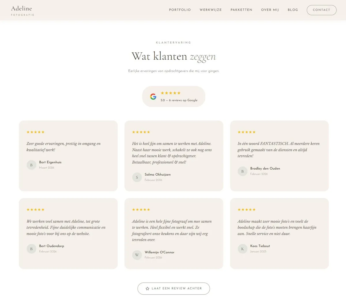
Five stars out of six Google reviews, pulled in and shown on the site. Good for visitors and for local findability.
The result
What pleases me most isn't in a chart but in practice.
4
paying assignments via the contact form
Since the new site went live, from clients who had found Adeline via Google. We don't know that from an assumption, it came out of the conversations that followed.
With that, the site does exactly what it was built for. The old version was a portfolio you looked at. The new version gets found by name and by keyword, sets out a clear proposition and leads the visitor to contact. From photo album to an engine for bringing in work, and that in a market where a photographer normally relies mostly on word of mouth.
SEO isn't a switch you flip. Google needs time to pick everything up and we keep tracking the positions. But the direction is clear and the first assignments are in.
The About page. The face behind the work, because people hire people.
How I work
From strategy to measurable result.
This project shows what I do as an interim consultant and project manager. Not one piece of it, but the whole journey. From the strategy and the goal up front, through the design and the technology, to findability and ultimately the measurable result. Conceived myself, built myself, adjusted myself when needed. I don't hand over loose pieces and throw it over the fence, I carry a project from start to finish and stay with it until it works.
Contact
See the site yourself.
Reading this and still looking for a photographer for your interior, holiday home or business premises? Then you'll know first-hand whether that contact form works.
To adelinefotografie.nl (opens in a new window)